how to do it in Excel — storytelling with data
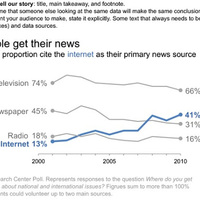
One common piece of feedback I get after presenting on the topic of data visualization goes something like this: Wow, that was super useful. I'm never going to use pie charts again. But when it comes to the graphs, how do you actually make them look like that? I'm not Excel-savvy

